A field guide · 116 styles
Every interface style, worn by this page.
From skeuomorphism to Liquid Glass — learn where each style came from and what defines it, then switch it on and watch the whole site change.
Start here 8 defining styles
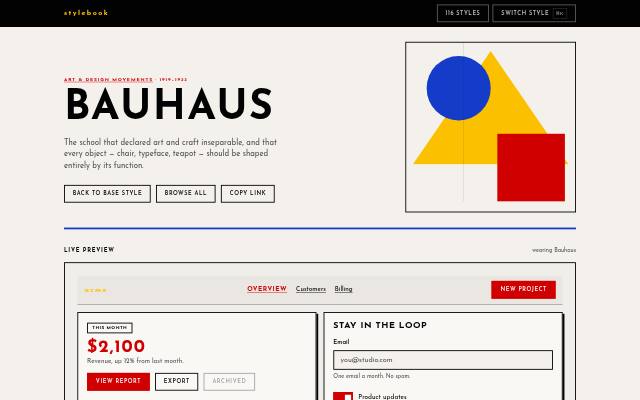 1919–1933
 Bauhaus
The school that declared art and craft inseparable, and that every object — chair, typeface, teapot — should be shaped entirely by its function.
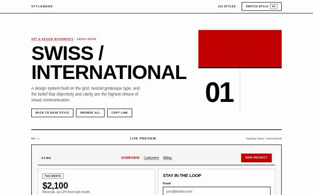 1950s–1970s
 Swiss / International
A design system built on the grid, neutral grotesque type, and the belief that objectivity and clarity are the highest virtues of visual communication.
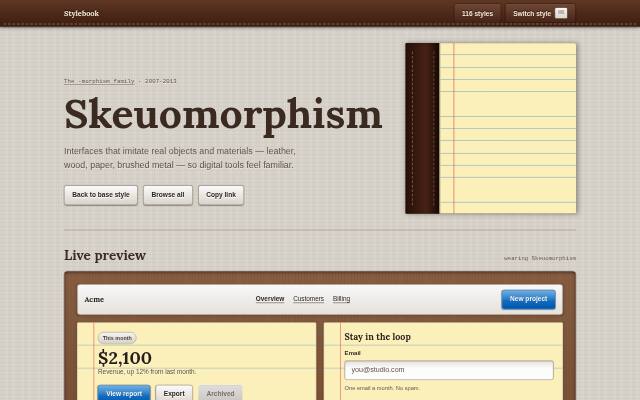 2007–2013
 Skeuomorphism
Interfaces that imitate real objects and materials — leather, wood, paper, brushed metal — so digital tools feel familiar.
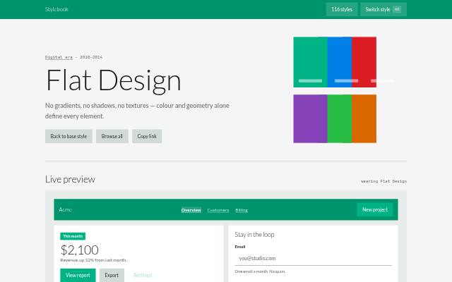 2010–2014
 Flat Design
No gradients, no shadows, no textures — colour and geometry alone define every element.
 2014–present
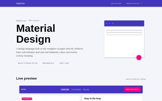
 Material Design
A design language built on the metaphor of paper and ink: surfaces have real elevation and cast real shadows; colour and motion convey meaning.
 2019–2021
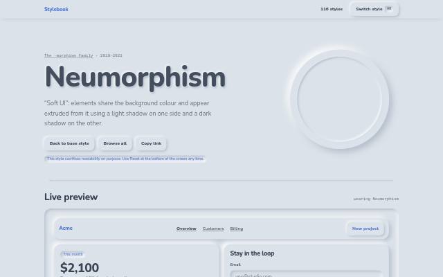
 Neumorphism
“Soft UI”: elements share the background colour and appear extruded from it using a light shadow on one side and a dark shadow on the other.
 2020–present
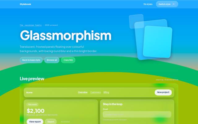
 Glassmorphism
Translucent, frosted panels floating over colourful backgrounds, with background blur and a thin bright border.
 2025–present
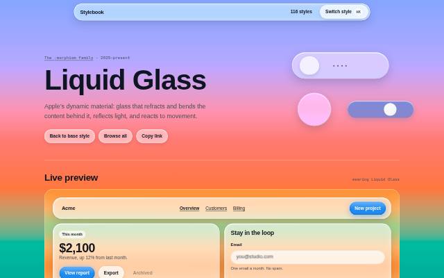
 Liquid Glass
Apple’s dynamic material: glass that refracts and bends the content behind it, reflects light, and reacts to movement.
All 116 styles 116 shown
The -morphism family 6
2007–2013 Skeuomorphism
Interfaces that imitate real objects and materials — leather, wood, paper, brushed metal — so digital tools feel familiar.
2019–2021 Neumorphism
“Soft UI”: elements share the background colour and appear extruded from it using a light shadow on one side and a dark shadow on the other.
2020–present Glassmorphism
Translucent, frosted panels floating over colourful backgrounds, with background blur and a thin bright border.
2025–present Liquid Glass
Apple’s dynamic material: glass that refracts and bends the content behind it, reflects light, and reacts to movement.
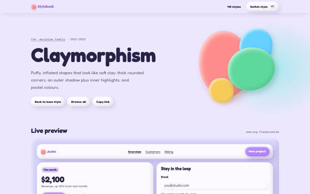 2021–2023
 Claymorphism
Puffy, inflated shapes that look like soft clay: thick rounded corners, an outer shadow plus inner highlights, and pastel colours.
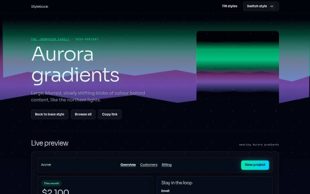 2020–present
 Aurora gradients
Large, blurred, slowly shifting blobs of colour behind content, like the northern lights.
Art & design movements 9
1950s–1970s Swiss / International
A design system built on the grid, neutral grotesque type, and the belief that objectivity and clarity are the highest virtues of visual communication.
1919–1933 Bauhaus
The school that declared art and craft inseparable, and that every object — chair, typeface, teapot — should be shaped entirely by its function.
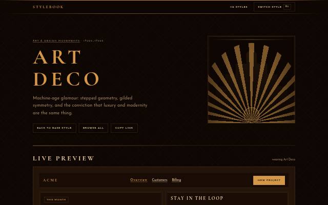 1920s–1930s
 Art Deco
Machine-age glamour: stepped geometry, gilded symmetry, and the conviction that luxury and modernity are the same thing.
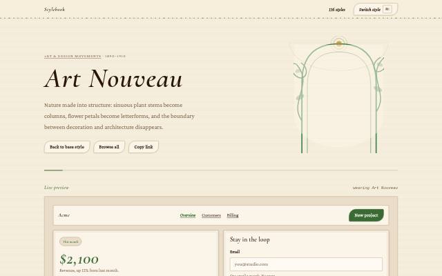 1890–1910
 Art Nouveau
Nature made into structure: sinuous plant stems become columns, flower petals become letterforms, and the boundary between decoration and architecture disappears.
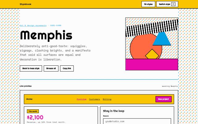 1980–1987
 Memphis
Deliberately anti-good-taste: squiggles, zigzags, clashing brights, and an attitude that treated decoration as liberation rather than crime.
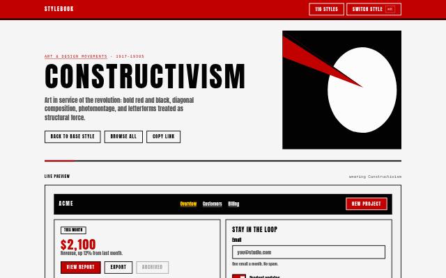 1917–1930s
 Constructivism
Art in service of the revolution: bold red and black, diagonal composition, photomontage, and letterforms treated as structural force.
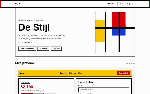 1917–1931
 De Stijl
Universal harmony through reduction: only primary colours, only horizontal and vertical lines, only the rectangle.
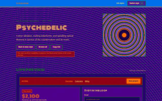 Late 1960s
 Psychedelic
Colour vibration, melting letterforms, and spiralling optical illusions in service of the counterculture and its music.
 1950s–1970s
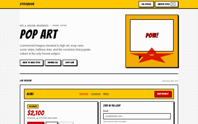
 Pop Art
Commercial imagery elevated to high art: soup cans, comic strips, halftone dots, and the conviction that popular culture is the only honest subject.
Digital era 14
2010–2014 Flat Design
No gradients, no shadows, no textures — colour and geometry alone define every element.
 2014–2018
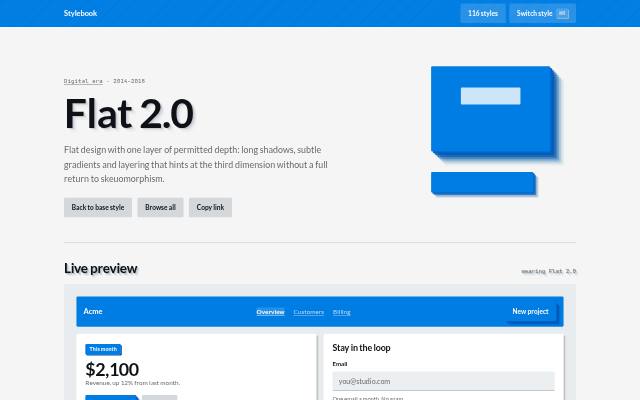
 Flat 2.0
Flat design with one layer of permitted depth: long shadows, subtle gradients and layering that hints at the third dimension without a full return to skeuomorphism.
2014–present Material Design
A design language built on the metaphor of paper and ink: surfaces have real elevation and cast real shadows; colour and motion convey meaning.
 2017–present
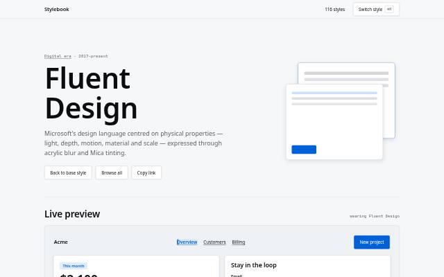
 Fluent Design
Microsoft's design language centred on physical properties — light, depth, motion, material and scale — expressed through acrylic blur and Mica tinting.
 1984–present
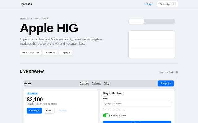
 Apple HIG
Apple's Human Interface Guidelines: clarity, deference and depth — interfaces that get out of the way and let content lead.
 2010s–present
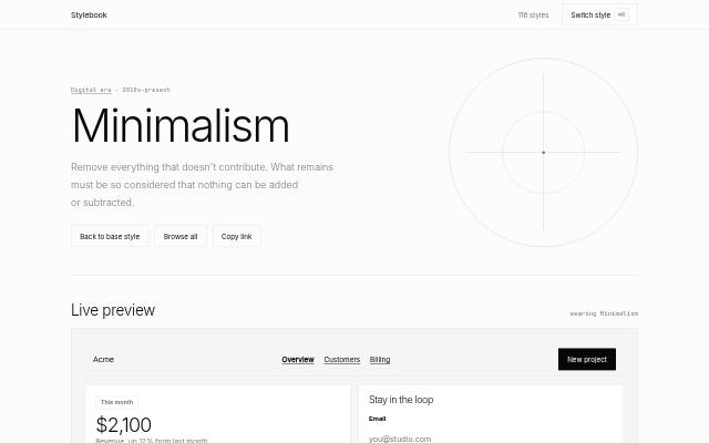
 Minimalism
Remove everything that doesn't contribute. What remains must be so considered that nothing can be added or subtracted.
 2014–present
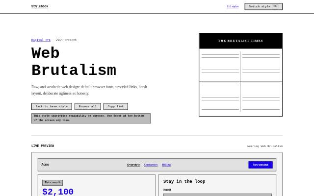
 Web Brutalism
Raw, anti-aesthetic web design: default browser fonts, unstyled links, harsh layout, deliberate ugliness as honesty.
 2021–present
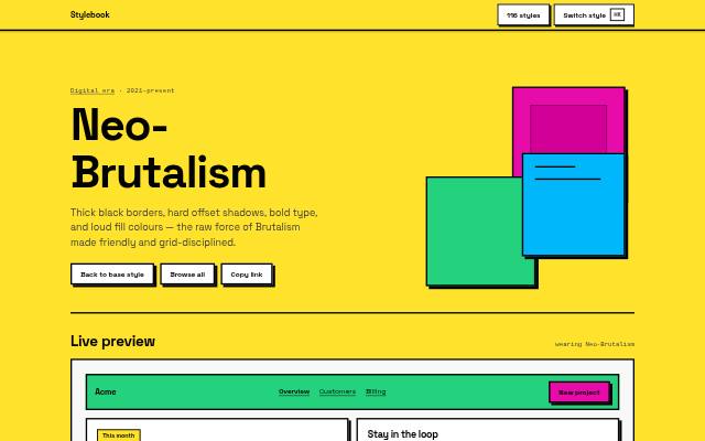
 Neo-Brutalism
Thick black borders, hard offset shadows, bold type, and loud fill colours — the raw force of Brutalism made friendly and grid-disciplined.
 2023–present
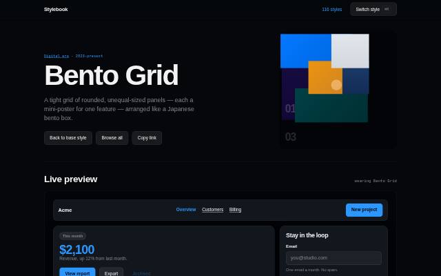
 Bento Grid
A tight grid of rounded, unequal-sized panels — each a mini-poster for one feature — arranged like a Japanese bento box.
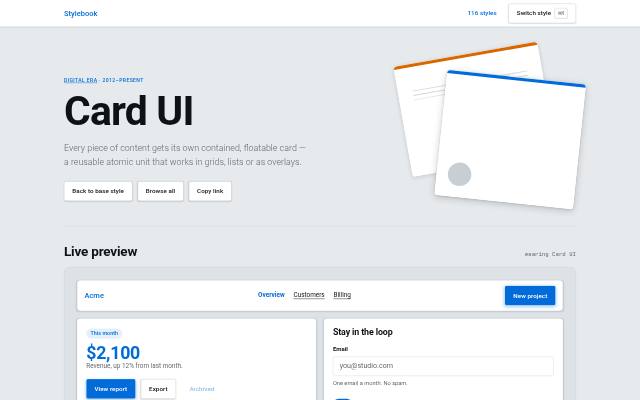 2012–present
 Card UI
Every piece of content gets its own contained, floatable card — a reusable atomic unit that works in grids, lists or as overlays.
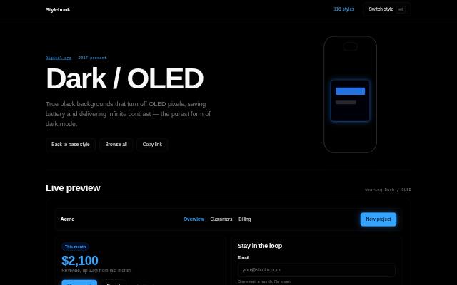 2017–present
 Dark / OLED
True black backgrounds that turn off OLED pixels, saving battery and delivering infinite contrast — the purest form of dark mode.
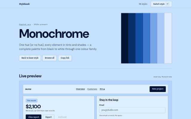 2010s–present
 Monochrome
One hue (or no hue), every element in tints and shades — a complete palette from black to white through one colour family.
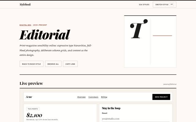 2015–present
 Editorial
Print-magazine sensibility online: expressive type hierarchies, full-bleed photography, deliberate column grids, and content as the entire design.
 2010s–present
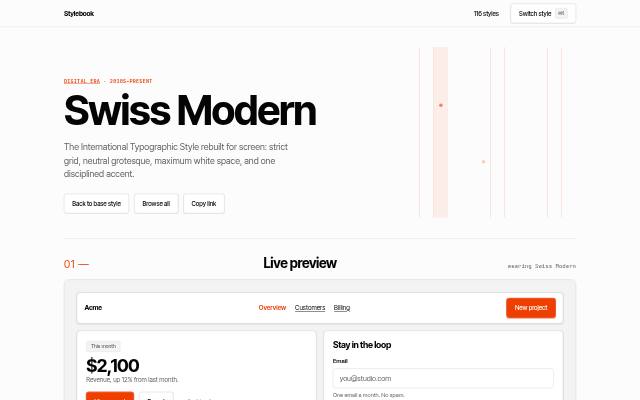
 Swiss Modern
The International Typographic Style rebuilt for screen: strict grid, neutral grotesque, maximum white space, and one disciplined accent.
Retro & nostalgia 9
 Late 1990s – 2003
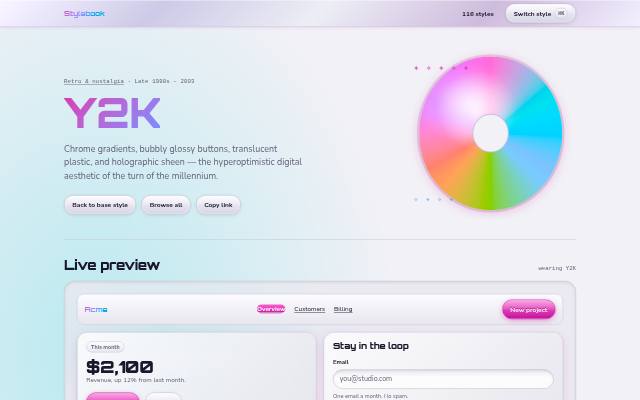
 Y2K
Chrome gradients, bubbly glossy buttons, translucent plastic, and holographic sheen — the hyperoptimistic digital aesthetic of the turn of the millennium.
 2004–2014
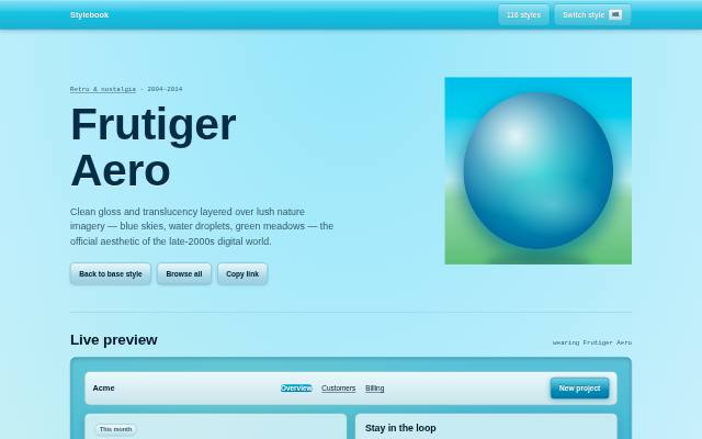
 Frutiger Aero
Clean gloss and translucency layered over lush nature imagery — blue skies, water droplets, green meadows — the official aesthetic of the late-2000s digital world.
 Early 2010s – present
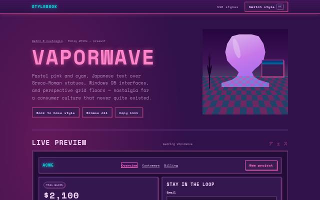
 Vaporwave
Pastel pink and cyan, Japanese text over Greco-Roman statues, Windows 95 interfaces, and perspective grid floors — nostalgia for a consumer culture that never quite existed.
 2010s – present
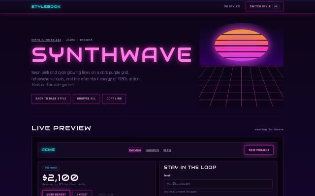
 Synthwave
Neon pink and cyan glowing lines on a dark purple grid, retrowave sunsets, and the after-dark energy of 1980s action films and arcade games.
 1950s – 1970s (origin); revival 2010s – present
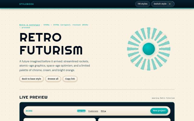
 Retro Futurism
A future imagined before it arrived: streamlined rockets, atomic-age graphics, space-age optimism, and a limited palette of chrome, cream, and bright orange.
 1980s – present
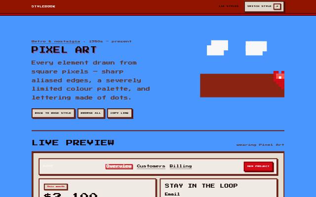
 Pixel Art
Every element drawn from square pixels — sharp aliased edges, a severely limited colour palette, and lettering made of dots.
 1995–2001
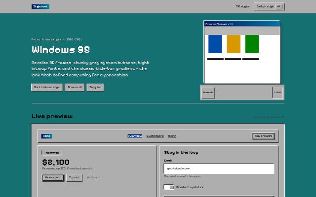
 Windows 95
Bevelled 3D frames, chunky grey system buttons, tight bitmap fonts, and the classic title-bar gradient — the look that defined computing for a generation.
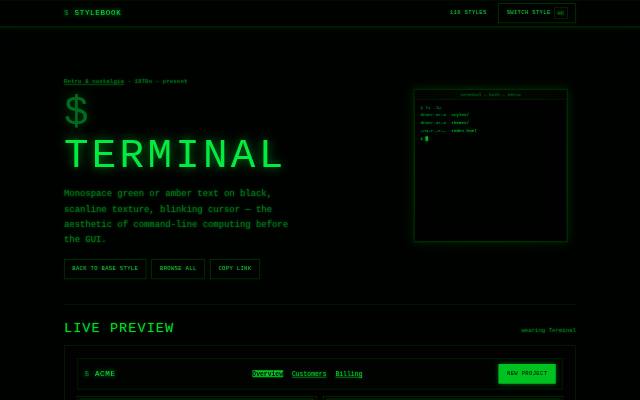 1970s – present
 Terminal
Monospace green or amber text on black, scanline texture, blinking cursor — the aesthetic of command-line computing before the GUI.
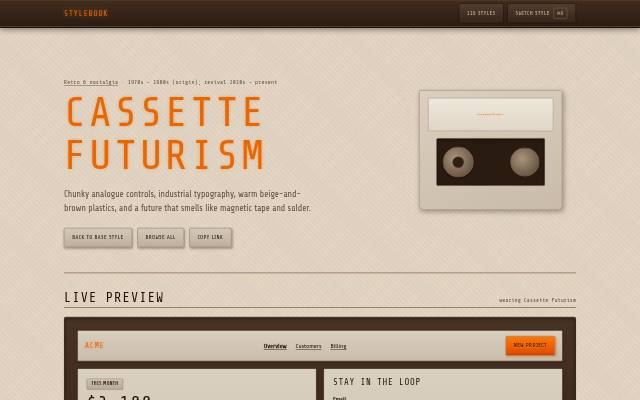 1970s – 1980s (origin); revival 2010s – present
 Cassette Futurism
Chunky analogue controls, industrial typography, warm beige-and-brown plastics, and a future that smells like magnetic tape and solder.
Expressive & trend 14
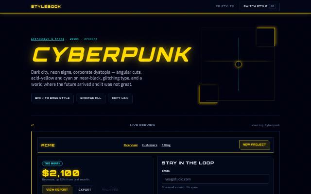 2010s – present
 Cyberpunk
Dark city, neon signs, corporate dystopia — angular cuts, acid-yellow and cyan on near-black, glitching type, and a world where the future arrived and it was not great.
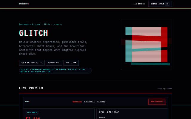 2010s – present
 Glitch
Colour channel separation, pixelated tears, horizontal shift bands, and the beautiful accidents that happen when digital signals break down.
 2010s – present
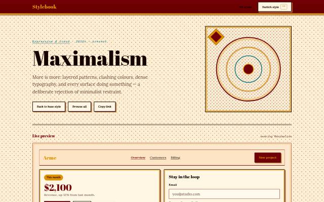
 Maximalism
More is more: layered patterns, clashing colours, dense typography, and every surface doing something — a deliberate rejection of minimalist restraint.
 1960s – 1970s (origin); digital revival 1990s – present
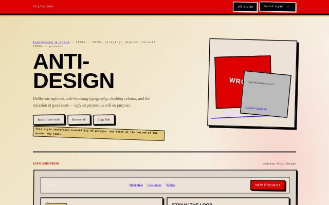
 Anti-Design
Deliberate ugliness, rule-breaking typography, clashing colours, and the rejection of good taste — ugly on purpose is still on purpose.
 1980s – 1990s (origin); revival 2010s – present
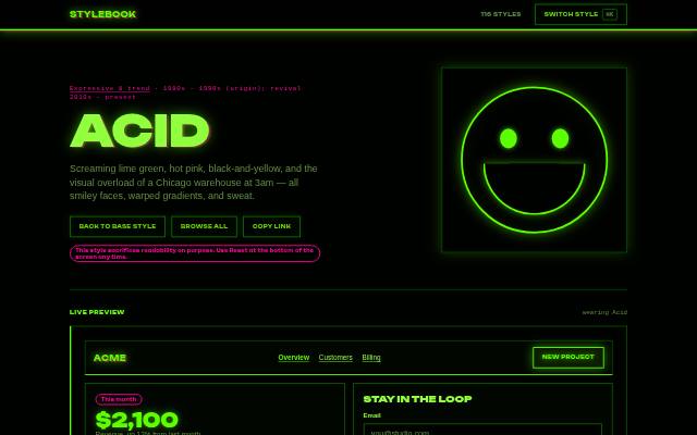
 Acid
Screaming lime green, hot pink, black-and-yellow, and the visual overload of a Chicago warehouse at 3am — all smiley faces, warped gradients, and sweat.
 2021 – present
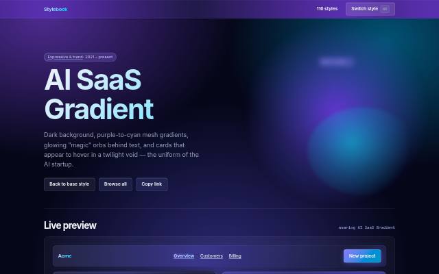
 AI SaaS Gradient
Dark background, purple-to-cyan mesh gradients, glowing "magic" orbs behind text, and cards that appear to hover in a twilight void — the uniform of the AI startup.
 2010s – present
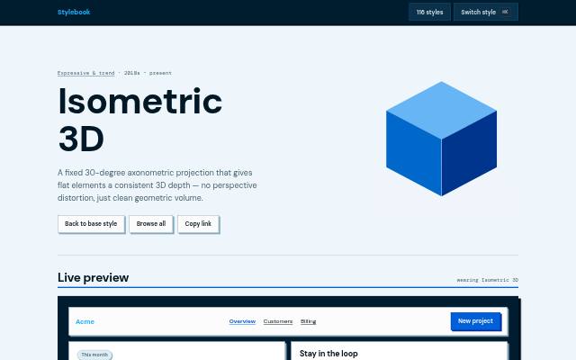
 Isometric 3D
A fixed 30-degree axonometric projection that gives flat elements a consistent 3D depth — no perspective distortion, just clean geometric volume.
 1950s–1990s (film/TV origin); digital 2010s – present
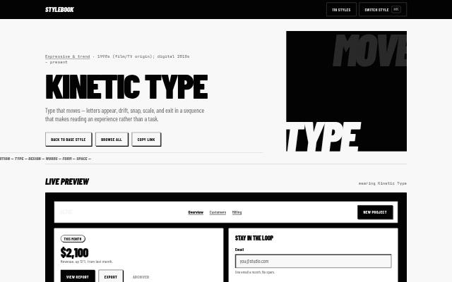
 Kinetic Type
Type that moves — letters appear, drift, snap, scale, and exit in a sequence that makes reading an experience rather than a task.
 2010s – present
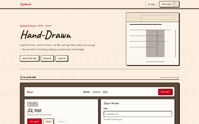
 Hand-Drawn
Imperfect lines, sketch textures, ink fills, and type that wobbles just enough — the warmth of something made by a human hand, intentionally.
 1910s (origin); digital revival 2010s – present
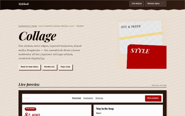
 Collage
Cut photos, torn edges, layered textures, mixed media fragments — the assembled-from-pieces aesthetic of the physical collage artist, rendered digitally.
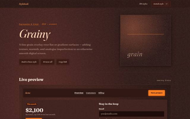 2018 – present
 Grainy
A fine grain overlay over flat or gradient surfaces — adding texture, warmth, and analogue imperfection to an otherwise smooth digital screen.
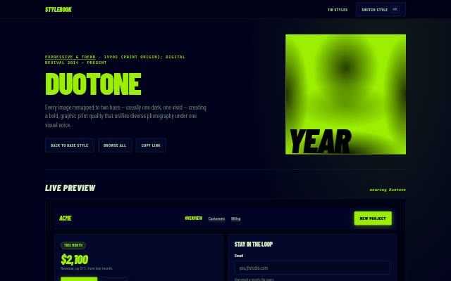 Print origin; digital revival 2015 – present
 Duotone
Every image remapped to two hues — usually one dark, one vivid — creating a bold, graphic print quality that unifies diverse photography under one visual voice.
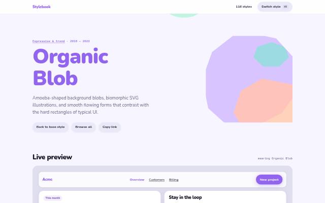 2018 – 2023
 Organic Blob
Amoeba-shaped background blobs, biomorphic SVG illustrations, and smooth flowing forms that contrast with the hard rectangles of typical UI.
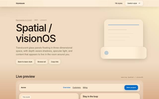 2023 – present
 Spatial / visionOS
Translucent glass panels floating in three-dimensional space, with depth-aware shadows, specular light, and content that appears to live in the room around you.
Cultural & regional 5
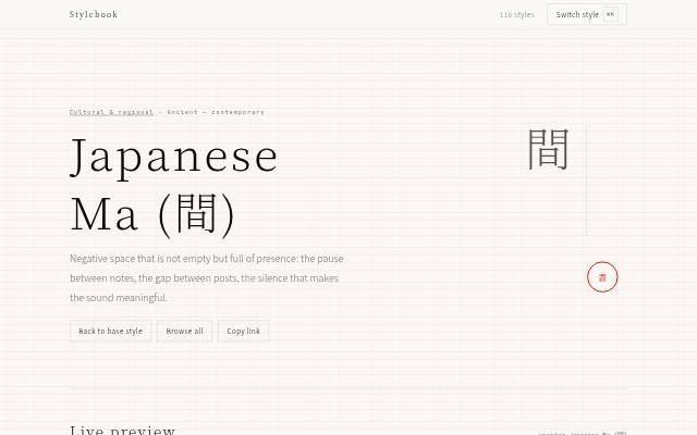 Ancient — contemporary
 Japanese Ma (間)
Negative space that is not empty but full of presence: the pause between notes, the gap between posts, the silence that makes the sound meaningful.
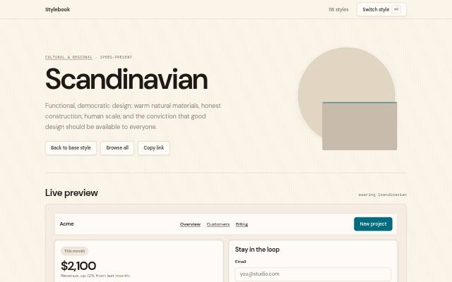 1950s–present
 Scandinavian
Functional, democratic design: warm natural materials, honest construction, human scale, and the conviction that good design should be available to everyone.
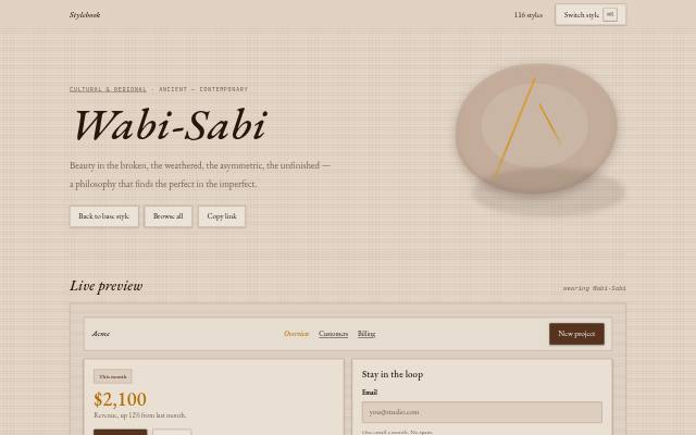 Ancient — contemporary
 Wabi-Sabi
Beauty in the broken, the weathered, the asymmetric, the unfinished — a philosophy that finds the perfect in the imperfect.
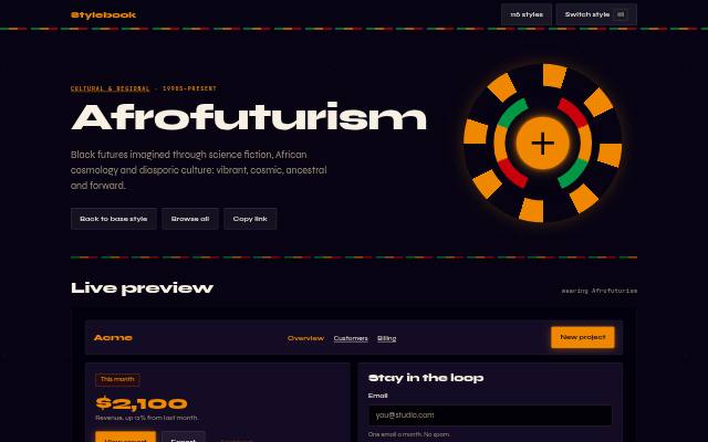 1990s–present
 Afrofuturism
Black futures imagined through science fiction, African cosmology and diasporic culture: vibrant, cosmic, ancestral and forward.
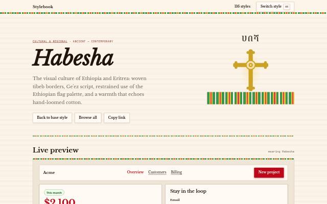 Ancient — contemporary
 Habesha
The visual culture of Ethiopia and Eritrea: woven tibeb borders, Ge'ez script, restrained use of the Ethiopian flag palette, and a warmth that echoes hand-loomed cotton.
Material & depth 13
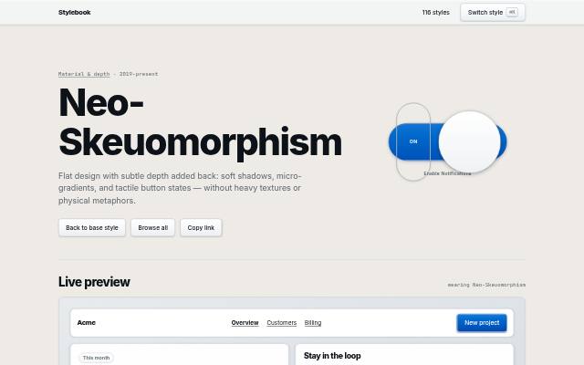 2019–present
 Neo-Skeuomorphism
Flat design with subtle depth added back: soft shadows, micro-gradients, and tactile button states — without heavy textures or physical metaphors.
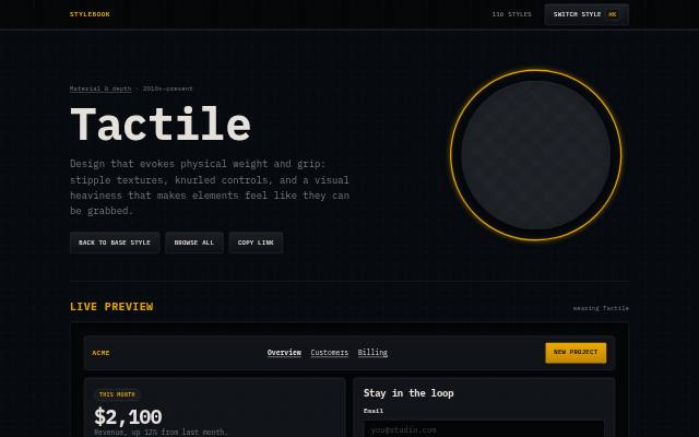 2010s–present
 Tactile
Design that evokes physical weight and grip: stipple textures, knurled controls, and a visual heaviness that makes elements feel like they can be grabbed.
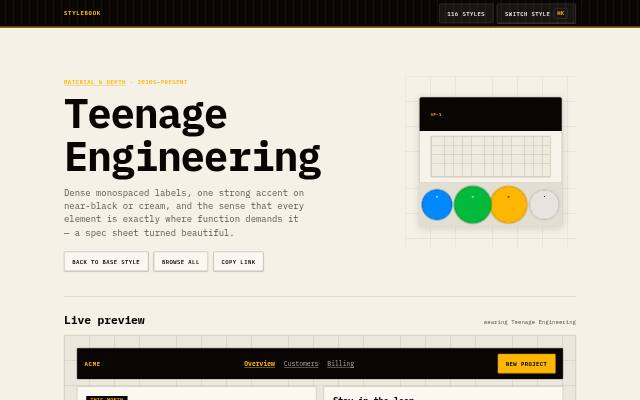 2010s–present
 Teenage Engineering
Dense monospaced labels, one strong accent on near-black or cream, and the sense that every element is exactly where function demands it — a spec sheet turned beautiful.
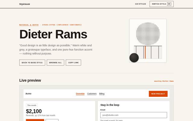 1950s–1970s (influence continues)
 Dieter Rams
"Good design is as little design as possible." Warm white and grey, a grotesque typeface, and one pure-hue function accent — nothing without purpose.
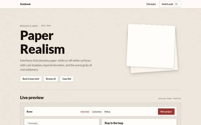 2012–2016
 Paper Realism
Interfaces that simulate paper: white or off-white surfaces with cast shadows, layered elevation, and the warm grain of real stationery.
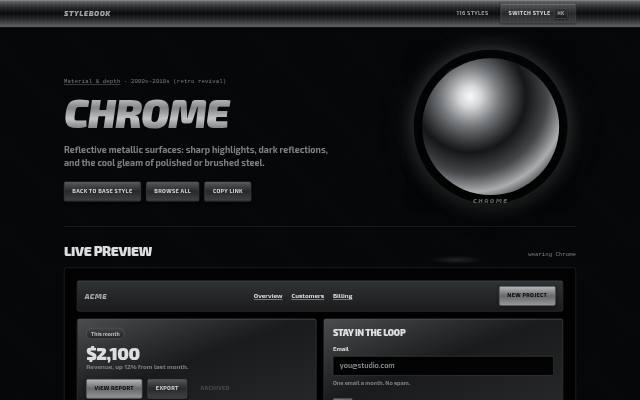 2000s–2010s (retro revival)
 Chrome
Reflective metallic surfaces: sharp highlights, dark reflections, and the cool gleam of polished or brushed steel.
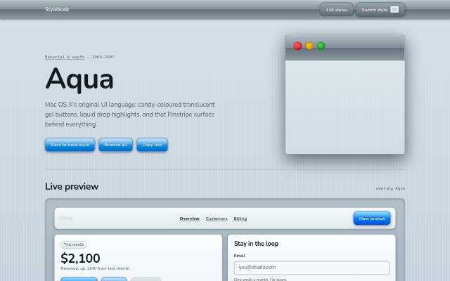 2000–2007
 Aqua
Mac OS X's original UI language: candy-coloured translucent gel buttons, liquid drop highlights, and that Pinstripe surface behind everything.
 2020s
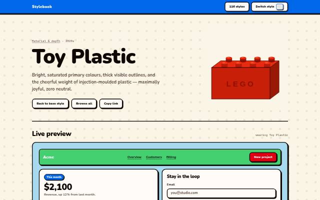
2020s Toy Plastic
Bright, saturated primary colours, thick visible outlines, and the cheerful weight of injection-moulded plastic — maximally joyful, zero neutral.
 2021–2023
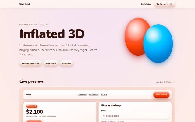
 Inflated 3D
UI elements and illustrations pumped full of air: rounded, bulging, smooth-sheen shapes that look like they might float off the screen.
 2009–2013
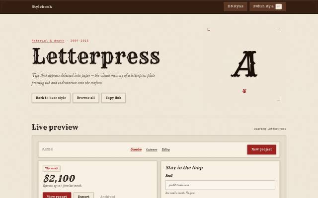
 Letterpress
Type that appears debossed into paper — the visual memory of a letterpress plate pressing ink and indentation into the surface.
 2008–2013
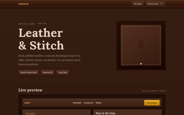
 Leather & Stitch
Dark pebbled leather, contrast stitching along every edge, and the luxury vocabulary of a premium hand-bound notebook.
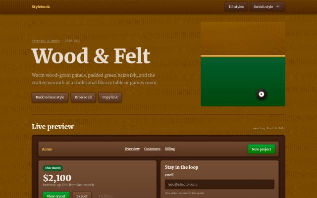 2010–2013
 Wood & Felt
Warm wood-grain panels, padded green baize felt, and the crafted warmth of a traditional library table or games room.
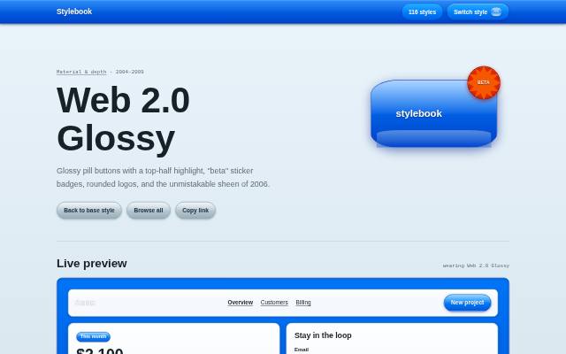 2004–2009
 Web 2.0 Glossy
Glossy pill buttons with a top-half highlight, "beta" sticker badges, rounded logos, and the unmistakable sheen of 2006.
Light & surface 7
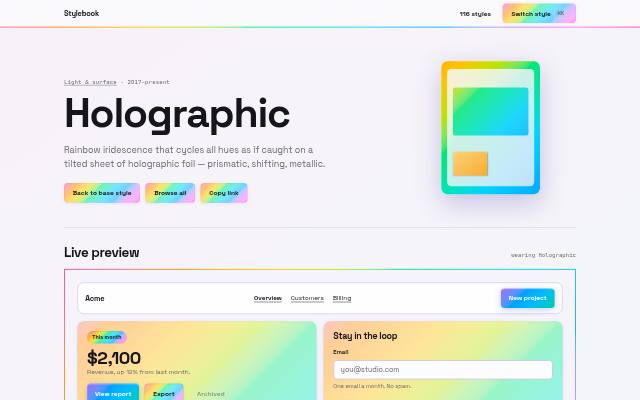 2017–present
 Holographic
Rainbow iridescence that cycles all hues as if caught on a tilted sheet of holographic foil — prismatic, shifting, metallic.
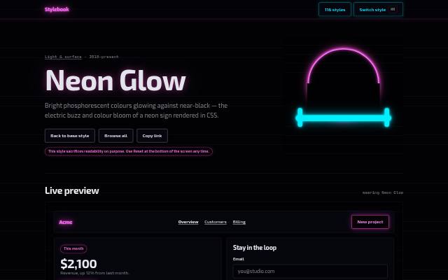 2018–present
 Neon Glow
Bright phosphorescent colours glowing against near-black — the electric buzz and colour bloom of a neon sign rendered in CSS.
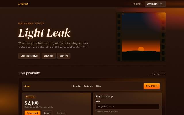 2012–2017
 Light Leak
Warm orange, yellow, and magenta flares bleeding across a surface — the accidental beautiful imperfection of old film.
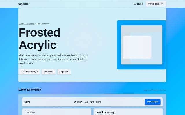 2014–present
 Frosted Acrylic
Thick, near-opaque frosted panels with heavy blur and a cool light tint — more substantial than glass, closer to a physical acrylic sheet.
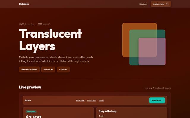 2015–present
 Translucent Layers
Multiple semi-transparent sheets stacked over each other, each letting the colour of what lies beneath bleed through and mix.
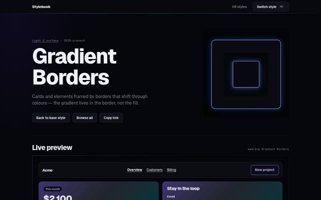 2020–present
 Gradient Borders
Cards and elements framed by borders that shift through colours — the gradient lives in the border, not the fill.
 2018–present
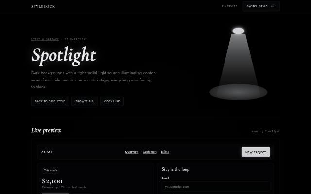
 Spotlight
Dark backgrounds with a tight radial light source illuminating content — as if each element sits on a studio stage, everything else fading to black.
Layout-driven 8
 2009–present
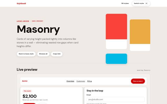
 Masonry
Cards of varying height packed tightly into columns like stones in a wall — eliminating wasted row gaps when card heights differ.
 2010s–present
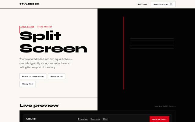
 Split Screen
The viewport divided into two equal halves — one side typically visual, one textual — each telling its own part of the story.
 2010s–present
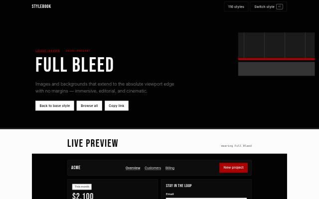
 Full Bleed
Images and backgrounds that extend to the absolute viewport edge with no margins — immersive, editorial, and cinematic.
 2016–present
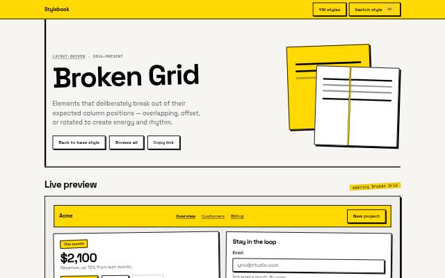
 Broken Grid
Elements that deliberately break out of their expected column positions — overlapping, offset, or rotated to create energy and rhythm.
 2012–present
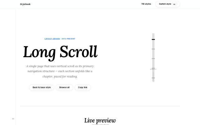
 Long Scroll
A single page that uses vertical scroll as its primary navigation structure — each section unfolds like a chapter, paced for reading.
 2010s–present
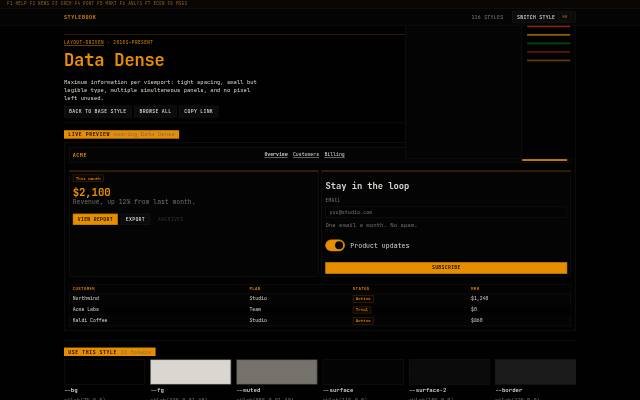
 Data Dense
Maximum information per viewport: tight spacing, small but legible type, multiple simultaneous panels, and no pixel left unused.
 2011–present
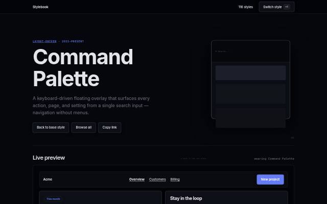
 Command Palette
A keyboard-driven floating overlay that surfaces every action, page, and setting from a single search input — navigation without menus.
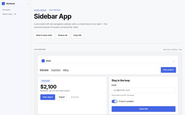 2013–present
 Sidebar App
A persistent left-rail navigation sidebar with a content area to its right — the canonical layout of modern productivity SaaS.
Typography-led 6
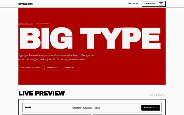 2010s–present
 Big Type
Typography used at extreme scale — letters that bleed off edges and crowd out images, making words the primary visual element.
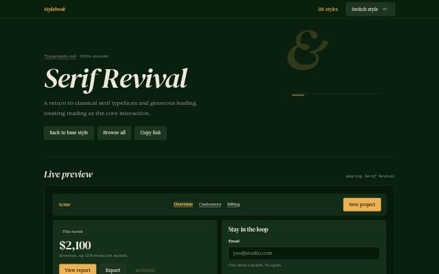 2010s–present
 Serif Revival
A return to classical serif typefaces and generous leading, treating reading as the core interaction.
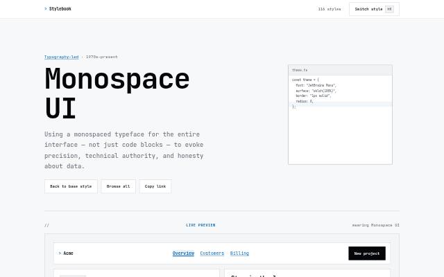 1970s–present
 Monospace UI
Using a monospaced typeface for the entire interface — not just code blocks — to evoke precision, technical authority, and honesty about data.
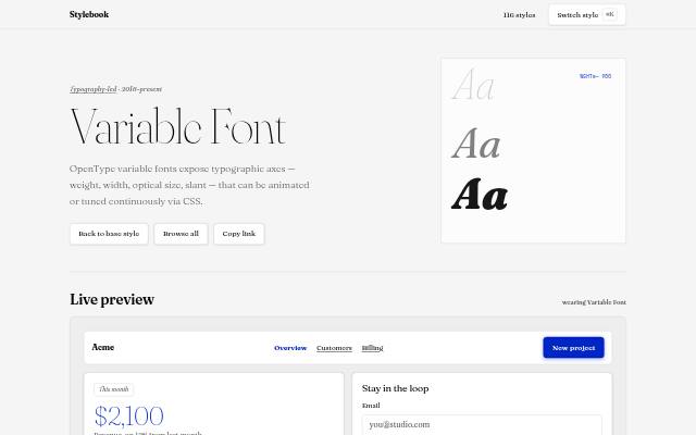 2016–present
 Variable Font
OpenType variable fonts expose typographic axes — weight, width, optical size, slant — that can be animated or tuned continuously via CSS.
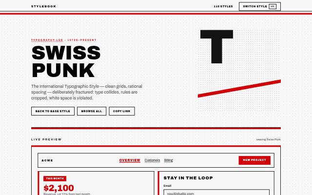 1970s–present
 Swiss Punk
The International Typographic Style — clean grids, rational spacing — deliberately fractured: type collides, rules are cropped, white space is violated.
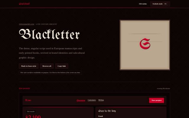 12th century–present
 Blackletter
The dense, angular script used in European manuscripts and early printed books, revived in brand identities and subcultural graphic design.
Illustration 8
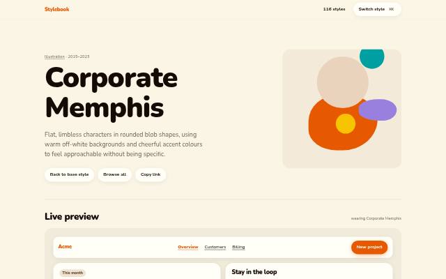 2015–2023
 Corporate Memphis
Flat characters with long, bendy limbs and small heads in rounded blob shapes, using warm off-white backgrounds and cheerful accent colours to feel approachable without being specific.
 Perennial
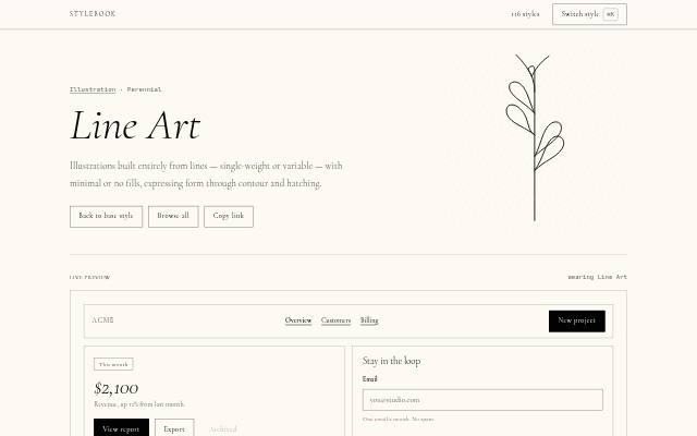
 Line Art
Illustrations built entirely from lines — single-weight or variable — with minimal or no fills, expressing form through contour and hatching.
 2012–2018
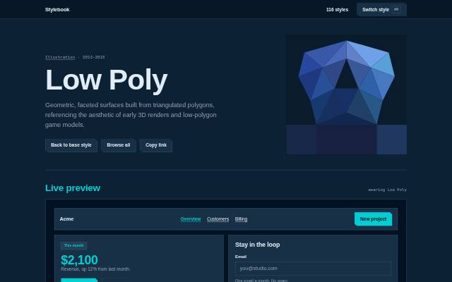
 Low Poly
Geometric, faceted surfaces built from triangulated polygons, referencing the aesthetic of early 3D renders and low-polygon game models.
 1920s–present (digital revival 2020–present)
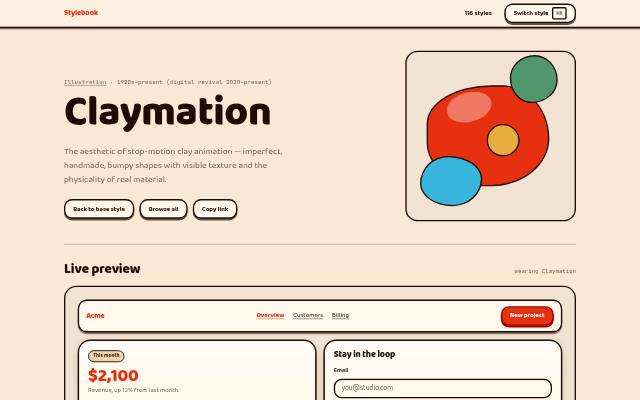
 Claymation
The aesthetic of stop-motion clay animation — imperfect, handmade, bumpy shapes with visible texture and the physicality of real material.
 1980s–present
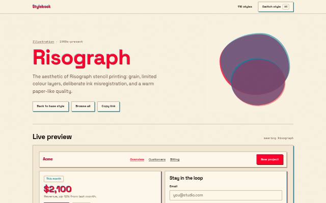
 Risograph
The aesthetic of Risograph stencil printing: grain, limited colour layers, deliberate ink misregistration, and a warm paper-like quality.
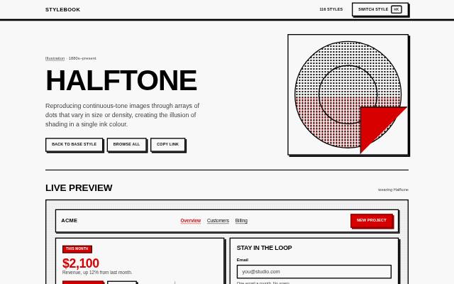 1880s–present
 Halftone
Reproducing continuous-tone images through arrays of dots that vary in size or density, creating the illusion of shading in a single ink colour.
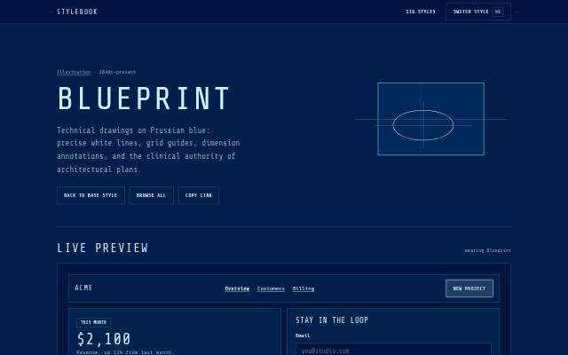 1840s–present
 Blueprint
Technical drawings on Prussian blue: precise white lines, grid guides, dimension annotations, and the clinical authority of architectural plans.
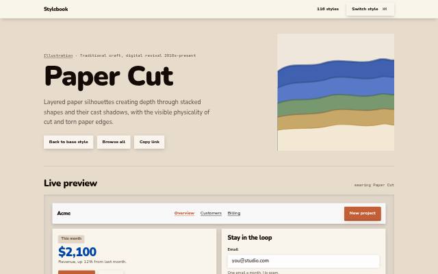 Traditional craft, digital revival 2010s–present
 Paper Cut
Layered paper silhouettes creating depth through stacked shapes and their cast shadows, with the visible physicality of cut and torn paper edges.
Mood & theme 11
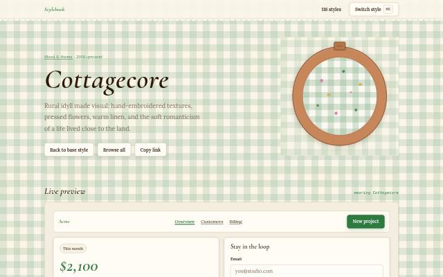 2018–present
 Cottagecore
Rural idyll made visual: hand-embroidered textures, pressed flowers, warm linen, and the soft romanticism of a life lived close to the land.
 2015–present
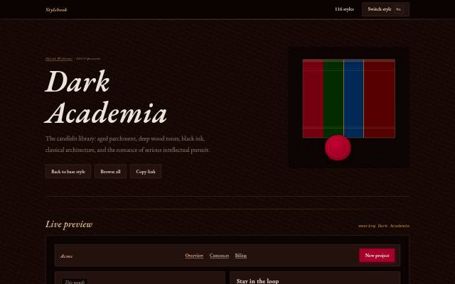
 Dark Academia
The candlelit library: aged parchment, deep wood tones, black ink, classical architecture, and the romance of serious intellectual pursuit.
 2008–present
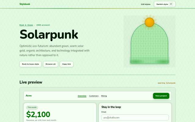
 Solarpunk
Optimistic eco-futurism: abundant green, warm solar gold, organic architecture, and technology integrated with nature rather than opposed to it.
 1980s–present
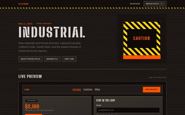
 Industrial
Raw materials and honest structure: exposed concrete, oxidised metal, riveted steel, and the austere beauty of functional factory spaces.
 1990s–present
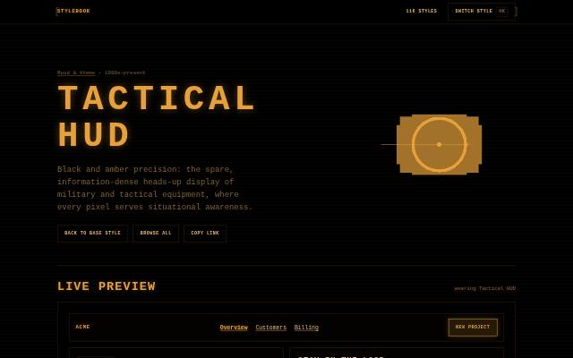
 Tactical HUD
Black and amber precision: the spare, information-dense heads-up display of military and tactical equipment, where every pixel serves situational awareness.
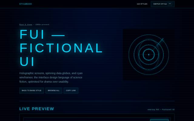 1980s–present
 FUI — Fictional UI
Holographic screens, spinning data globes, and cyan wireframes: the interface design language of science fiction, optimised for drama over usability.
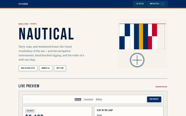 Perennial
 Nautical
Navy, rope, and weathered brass: the visual vocabulary of the sea — precise navigation instruments, hand-knotted rigging, and the order of a well-run ship.
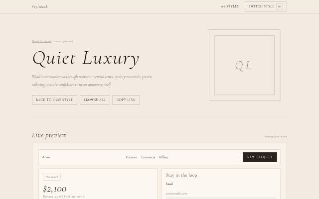 2020s–present
 Quiet Luxury
Wealth communicated through restraint: neutral tones, quality materials, precise tailoring, and the confidence to never announce itself.
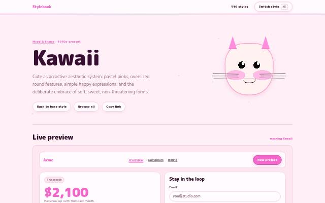 1970s–present
 Kawaii
Cute as an active aesthetic system: pastel pinks, oversized round features, simple happy expressions, and the deliberate embrace of soft, sweet, non-threatening forms.
 1988–present
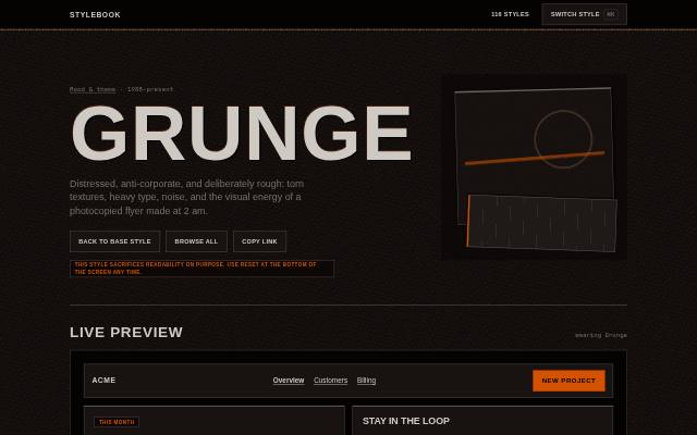
 Grunge
Distressed, anti-corporate, and deliberately rough: torn textures, heavy type, noise, and the visual energy of a photocopied flyer made at 2 am.
 1930s–present
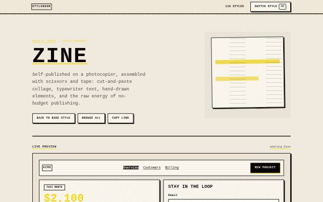
 Zine
Self-published on a photocopier, assembled with scissors and tape: cut-and-paste collage, typewriter text, hand-drawn elements, and the raw energy of no-budget publishing.
Platform-native 6
 2021 – present
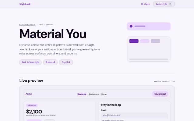
 Material You
Dynamic colour: the entire UI palette is derived from a single seed colour — your wallpaper, your brand, you — generating tonal roles across surfaces, containers, and accents.
 2019 – present
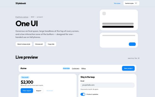
 One UI
Generous vertical space, large headlines at the top of every screen, and a low interaction zone at the bottom — designed for one-handed use on tall phones.
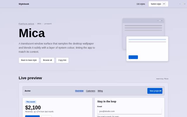 2021 – present
 Mica
An opaque window backdrop that samples the desktop wallpaper and blends it subtly with a layer of system colour, tinting the app to match its context.
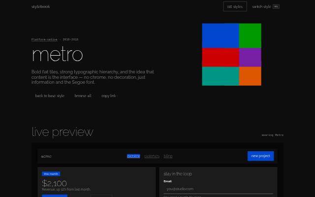 2010–2015
 Metro
Bold flat tiles, strong typographic hierarchy, and the idea that content is the interface — no chrome, no decoration, just information and the Segoe font.
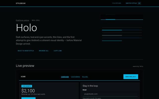 2011–2014
 Holo
Dark surfaces, cyan-blue accents, thin lines, and the first attempt to give Android a coherent visual identity — before Material Design arrived.
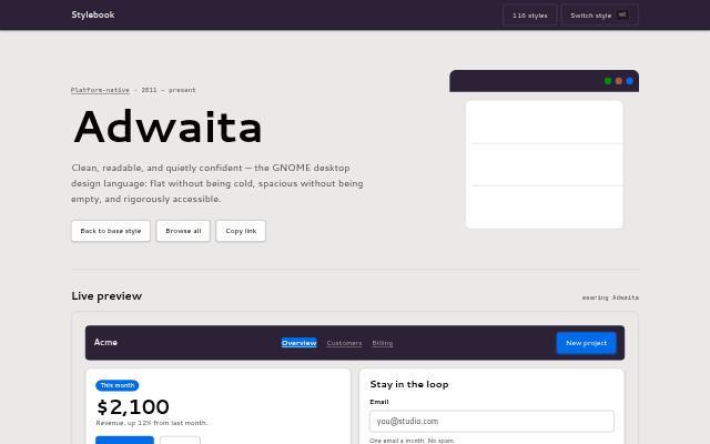 2011 – present
 Adwaita
Clean, readable, and quietly confident — the GNOME desktop design language: flat without being cold, spacious without being empty, and rigorously accessible.